Lean Tools Module

Structured Problem-Solving, Built In

Five proven lean methodologies 5 Whys, Ishikawa, Pareto, Value Stream Mapping, and KT Decision Analysis all linked to your ideas, actions, and projects.

5
Lean Tools
PDF Export on Every Tool
Linked to Ideas & Actions
SVG Diagrams & Charts
Multi-User Collaboration

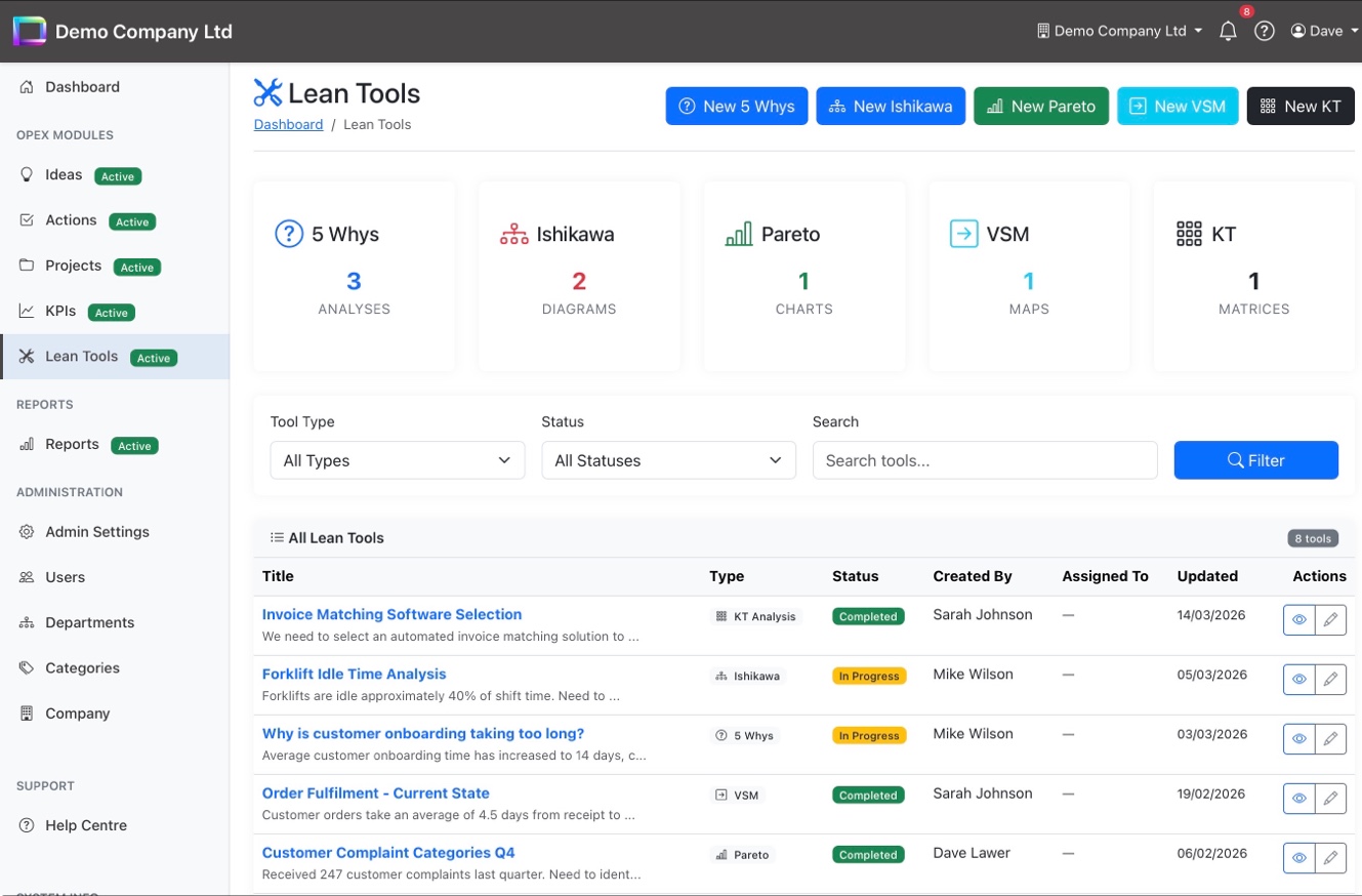
All Your Lean Tools in One Place

The Lean Tools dashboard gives you a unified view across all five tool types. Stat cards show counts for each 5 Whys, Ishikawa, Pareto, VSM, and KT and every analysis is listed with its type, status, owner, and last update. Filter by tool type, status, or search by keyword.

Stat cards for each tool type with live counts
Filter by tool type, status, or search by keyword
Create new analyses directly from the toolbar
Quick-access view and edit buttons on every row
Lean Tools dashboard with stat cards, filters, and tool listing

5 Whys - Find the Root Cause

Start with a problem statement and drill down through up to five "why" questions to reach the root cause. Each step shows the question and its answer in a clear chain, making it easy to follow the logic and share findings with the team. Link directly to ideas or actions once the root cause is identified.

Problem statement with visual root cause chain
Up to 5 levels of "why" with question and answer
Link findings to ideas, actions, or projects
PDF export for reports and presentations
5 Whys root cause analysis with problem statement and why chain

Ishikawa — Fishbone Diagrams

Visualise cause and effect with interactive fishbone diagrams using the classic 6M categories: Man, Machine, Method, Material, Measure, and Environment. Causes are colour-coded by category and rendered as a full SVG diagram you can export to PDF. Star key causes to highlight them for follow-up.

Full SVG fishbone diagram with 6M categories
Colour-coded cause branches for easy reading
Star key causes to highlight priorities
Problem/effect statement shown below the diagram
Ishikawa fishbone diagram with 6M categories and colour-coded causes

Pareto — Focus on the Vital Few

Enter your data categories and counts, and OpExCore automatically generates a Pareto chart with the 80/20 line, cumulative percentages, and a clear breakdown of vital few versus trivial many. The "Where to Focus" summary tells you exactly which items to tackle first for the biggest impact.

Auto-generated Pareto chart with 80% threshold line
Vital few vs trivial many categorisation
"Where to Focus" summary with suggested actions
Data breakdown table with distribution bars and cumulative %
Pareto chart with 80/20 line, vital few highlighting, and data breakdown

Value Stream Mapping — See the Waste

Map your current-state processes step by step and instantly see total time, value-added time, wait time, and process efficiency. The visual process flow shows each step in sequence, while the efficiency bar highlights the split between value-added, non-value-added, and wait time at a glance.

Process flow diagram with step-by-step visualisation
Efficiency bar: value-added vs non-VA vs wait time
Summary stats: total steps, total time, value-added hours
Configurable time units (minutes, hours, days)
Value Stream Map with process flow, efficiency bar, and summary statistics

KT Decision Analysis — Choose With Confidence

Compare alternatives using Kepner-Tregoe methodology with must-have criteria (Go/No Go) and weighted want criteria. Simple mode uses star ratings for quick decisions; Advanced mode provides full weighted scoring matrices. The recommended choice is highlighted automatically based on total points.

Must-have criteria with Go/No Go elimination
Weighted want criteria with scored alternatives
Simple mode (star ratings) and Advanced mode (full KT)
Auto-calculated winner with point totals
KT Decision Analysis matrix with must-have and want criteria scoring

Solve Problems Systematically

Five lean tools, one platform from root cause analysis to data-driven decisions.