Reports & Dashboards

See the Full Picture, Instantly

Executive dashboards, KPI metrics, PDF and Excel exports, scheduled email reports, and a full audit trail everything you need to measure, report, and share progress.

Executive Dashboard
KPI Metrics
PDF & Excel Exports
Scheduled Reports
Full Audit Trail

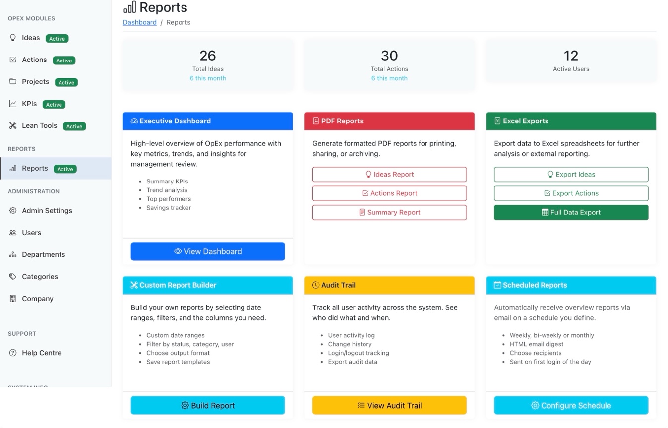
Reports Hub — Everything in One Place

The Reports landing page gives you quick access to every reporting tool on the platform. Summary stats at the top show total ideas, actions, and active users with month-on-month changes. From here you can jump to the Executive Dashboard, generate PDF or Excel reports, build custom reports, review the audit trail, or configure scheduled email digests.

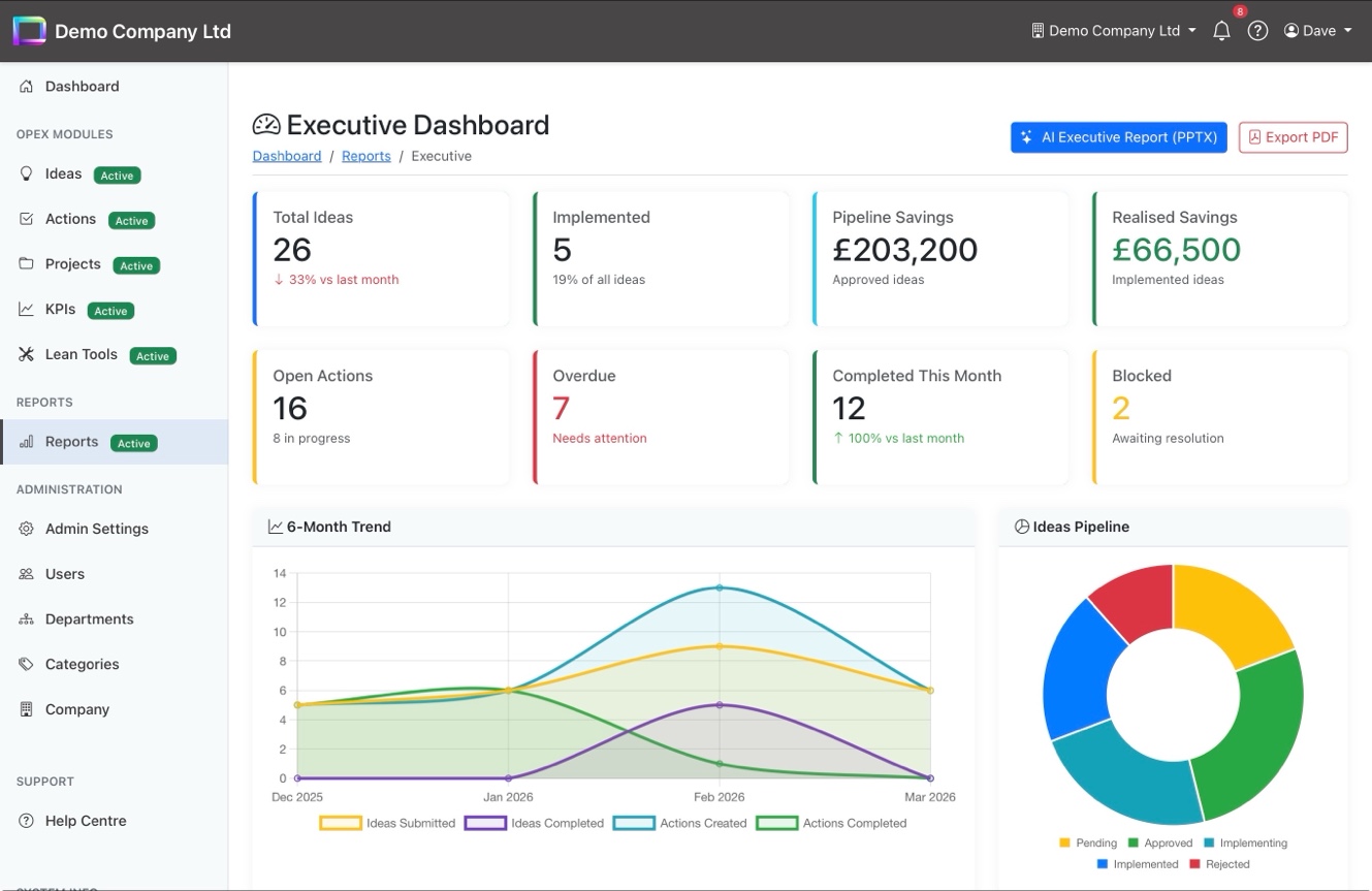
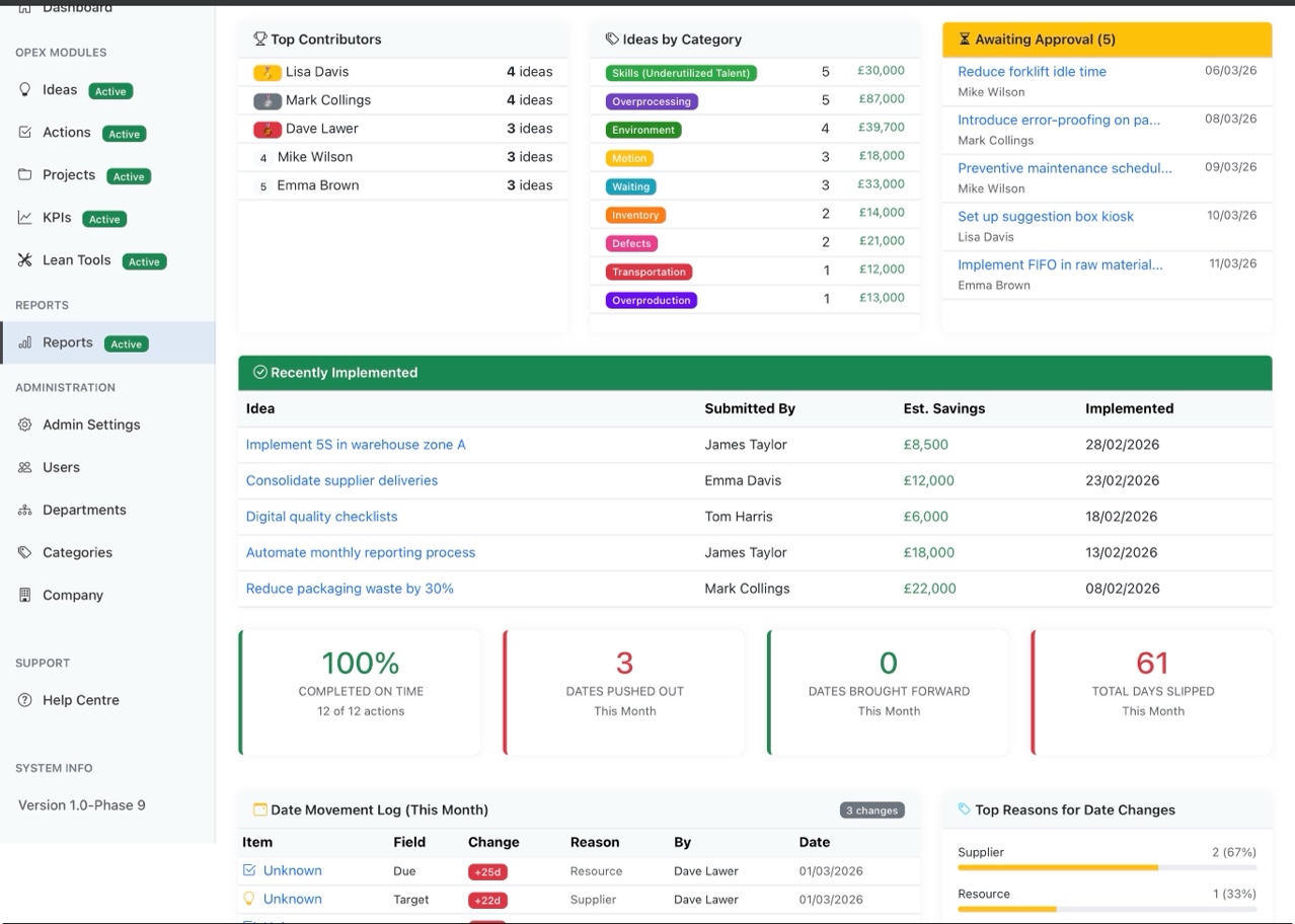
Executive Dashboard, PDF Reports, and Excel Exports
Custom Report Builder with saved templates
Scheduled Reports: weekly, bi-weekly, or monthly email digests
Audit Trail with login/logout and change history
Reports hub with Executive Dashboard, PDF Reports, Excel Exports, Custom Report Builder, Audit Trail, and Scheduled Reports

Executive Dashboard — Key Metrics at a Glance

Eight stat cards show the numbers that matter: total ideas, implemented count, pipeline and realised savings, open actions, overdue items, completions this month, and blocked items all with month-on-month comparisons. Below, a 6-month trend chart tracks ideas and actions over time, while the Ideas Pipeline doughnut shows the current status distribution.

8 stat cards with month-on-month comparisons
6-month trend chart for ideas and actions
Ideas Pipeline doughnut chart by status
AI Executive Report (PPTX) and PDF export buttons
Executive Dashboard with stat cards, 6-month trend chart, and Ideas Pipeline doughnut

Contributors, Categories & Schedule Performance

Scroll down the Executive Dashboard and you'll find top contributors with idea counts, ideas broken down by TIMWOODS waste category with estimated savings, and an awaiting-approval queue for managers. The recently implemented table shows realised savings, and the schedule performance section tracks on-time completion, date movements, and the reasons behind them.

Top contributors leaderboard
Ideas by waste category (TIMWOODS) with savings
Recently implemented ideas with realised savings
Schedule performance: on-time %, date movements, and reasons
Executive Dashboard detail: top contributors, ideas by category, recently implemented, and schedule performance

KPIs Dashboard — Performance Metrics

The KPIs Dashboard gives you a filterable view of operational performance. Three doughnut charts show actions by status, ideas pipeline, and ideas by waste category. Below, two rows of metric cards cover open actions, overdue count, completions, average days to complete, awaiting review, approval rate, implementation rate, and realised savings against your pipeline total.

Doughnut charts: actions, ideas pipeline, and waste categories
Filterable by time period (This Month, Last Quarter, etc.)
Approval rate, implementation rate, and average cycle time
Realised savings vs pipeline total
KPIs Dashboard with doughnut charts, metric cards, and time period filter

Data-Driven Continuous Improvement

Dashboards, exports, scheduled reports, and a full audit trail the visibility your leadership team needs.